Code
I’ve had the good fortune to work either directly or via contract for:
DDB Needham
Black Dot Group
WebStreet Securities
Allstate
PartnerData
Pampered Chef
Office Max/Office Depot
FTD
Sears
I choose to focus on PartnerData in this instance as example of what I can do with out making this page overly long. It should suffice as an illustration of my talents, think of it as a jumping off point to pursue further conversations of how I can help your organization.
Reorganize and Realign Acquisis to PartnerData
Acquisis CMS
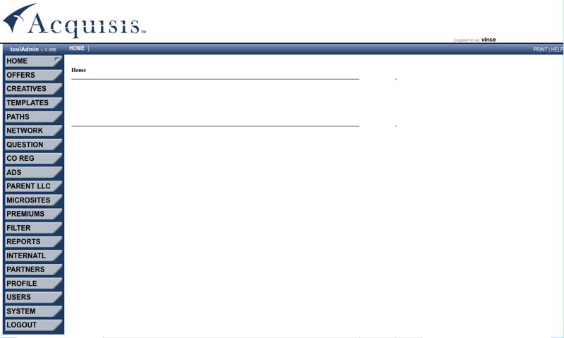
PartnerData bought out Acquisis to leverage the “Acquisis” proprietary CMS for managing Lead Generation, Co-Registration and Ad Networks. I was hired to take this tool that had been built ad-hoc and on the fly and then re-design, re-organize and make a cohesive CMS that was both intuitive and easy to use. As you can see every possible selection in the above image was contained in the left hand navigation. With occasional sub-menus then running across the top in the horizontal blue bar area. This layout led to a lot of “mousing around” that was both frustrating and worse yet, would lead to selections that had no content once you arrived, not a good user experience. Case in point the “Home” selection led you to an empty page as pictured above.
PartnerData CMS
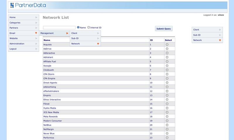
The first order of business was to centralize the CMS navigation to the left hand side and employ a hierarchical menu system of menus and sub-menus, to reduce “mousing around”. A “fly-out” menu made the most sense for establishing a consistent section, sub-section relationship. A secondary static menu flanked the content area on the right and contained a copy of the sub-section menu. This communicated your location within the section when the fly-out menu closed after you had selected your sub-section. The choice of a fly-out menu in this instance was to keep the main navigation tight and to the left side of the content and to reduce fatigue on the end user. The receded blue/gray color scheme while based on the corporate colors, was to reduce eye strain. Heavy use of the Inman Font replacement via graphical buttons, was replaced with CSS based navigation employing a site wide sprite for graphic elements, thus lightening the load to the server.
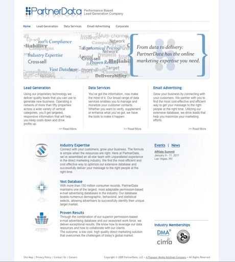
PartnerData Website
While working on the PartnerData CMS, I also designed and developed the forward facing PartnerData website.
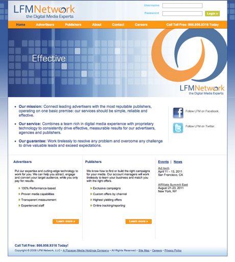
LFM Network Website
I also designed and developed their partner companies web site, the LFM network, which was the advertising arm of PartnerData.
LFM Network Email Header
Basically a graphical email header for use in a promotional campaign for LFM.